Academy's Logo
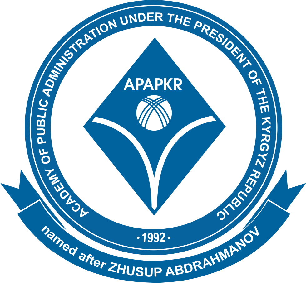
DESCRIPTION OF THE ACADEMY LOGO


The logo was developed in May 2015 and launched in November 2015.
The logo is designed in three languages: National, Official and Foreign - English.
The author of the logo is Academy’s staff.
The philosophy of the Academy logo is based on the basic principles of the treatise "Kuttuu Bilim" by Zhusup Balasagyn and is defined as "Quality education - the path to fair governance aimed at human development in the Kyrgyz Republic."
Logo form and content:
The shape is based on - Rhombus. The rhombus is a symbol of the material world as a whole, made up of four elements that correspond to the four cardinal points. This is a symbol of the proportionality of man with the cosmos, and the combination of two triangles of the rhombus means Knowledge and Power, which are located at the vertices of the triangle, give the highest Wisdom.
Inside the rhombus there is a line with a logical exit to the Tunduk, the shape of which symbolizes a person. Tunduk is a symbol of Kyrgyzstan, the main element of the coat of arms of the Kyrgyz Republic, belonging to the state of the Kyrgyz Republic. The figure in the form of a man symbolizes the orientation of the state towards human development in the country - the human resource "No. 1" in the Kyrgyz Republic, which is at the stage of formation and growth. The human body in the form of branched lines means rebirth and great opportunities for a person in the country.
Logo color tones:
Blue is the color of wisdom and faith. For many peoples, including among the Turkic peoples, blue is a symbol of eternity and heaven, symbolizing loyalty, honesty, chastity, constancy, kindness and good glory.


